Choosing your wedding colours 2025 is about more than just trends — it’s about setting the tone for your entire celebration. The right palette evokes emotion and turns even the simplest of wedding details into poetry. Whether you’re saying your vows under a dusky sky, beside rolling waves, or in a candlelit chapel, your choice of hues carries your love story from beginning to end.
This season, it’s all about intentional colour. From earthy minimalism to bold drama, here’s our guide to 2025’s most romantic, expressive, and meaningful wedding palettes, and how to make them your own.
1. Modern Earthy Neutrals, Understated Elegance, Elevated
Think soft clay, sandy beige, taupe, warm stone, and muted terracotta. This palette is for the bride who loves the quiet luxury of nature and minimalism. Earthy neutrals offer depth without distraction, allowing textures, architecture, and emotions to take centre stage.
Why We Love It:
- Perfect for winelands, bushveld, and Karoo settings.
- Complements South African natural light and landscapes.
- Works beautifully with dried florals, linen textures, and handmade ceramics.
Pair It With:
Rustic tableware, wooden elements, hand-calligraphed menus, and natural fabrics like raw silk and cotton. Add touches of brass or soft gold for a hint of sophistication.
2. Coastal Serenity Where the Tide Meets Romance
Inspired by the coast, this palette blends washed-out blues, seafoam greens, crisp whites, and sandy neutrals. It’s light, airy, and completely transportive, ideal for beach weddings or ocean-view venues like Cape Town, Ballito, or the Garden Route.
Why We Love It:
- Evokes a sense of calm and spaciousness.
- Works well with both minimalist and boho design styles.
- Pairs beautifully with flowing dresses, barefoot moments, and windswept hair.
Pair It With:
Sheer fabrics, hand-tied floral arrangements, oyster shells or coral details, and watercolour stationery. Think natural movement and organic shapes.
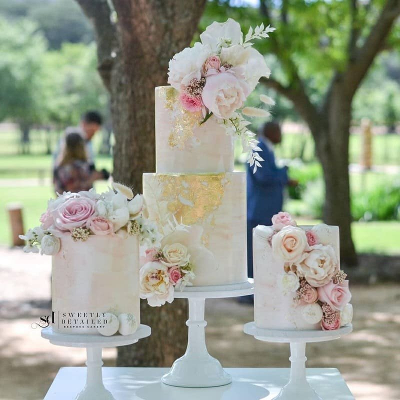
3. Eternal Pastels Soft, Dreamy, Timeless
Pastels are having a sophisticated resurgence. No longer just ‘cute’, today’s pastels are refined, layered, and deeply romantic. Picture dusty rose, lavender, butter yellow, powder blue, and blush, used intentionally and softly.
Why We Love It:
- Elevates traditional wedding romance without feeling dated.
- Ideal for spring or summer weddings with abundant floral design.
- Adds gentle colour without overwhelming the eye.
Pair It With:
Loose floral installations, delicate tulle gowns, pastel taper candles, vintage glassware, and painted cakes. Keep the styling whimsical, not overly polished.
4. Sunset Hues Bold, Passionate, Golden Hour Magic
There’s nothing quite like a South African sunset. Capture that magic with a palette of burnt orange, ochre, warm pinks, sienna, amber, and marigold. This palette works wonderfully for outdoor celebrations timed with golden hour and has a dramatic warmth that’s unforgettable.
Why We Love It:
- Glows in photographs (especially film).
- Feels joyful, passionate, and alive.
- Ideal for vibrant, expressive couples.
Pair It With:
Sunset-toned florals (like dahlias, ranunculus, and roses), textured fabrics, woven details, and candlelight. Add richness with terracotta pots, amber glassware, and handmade paper.
5. Classic Black & White Minimal. Sophisticated. Iconic.
Timeless never goes out of style. Black and white is more than just elegant, it’s bold, striking, and undeniably chic. It strips away the noise and focuses on form, contrast, and elegance.
Why We Love It:
- Universally flattering and forever stylish.
- Works with any venue, from industrial lofts to traditional churches.
- Effortlessly modern with a nod to the past.
Pair It With:
Monochrome florals, crisp stationery, black velvet ribbons, high-contrast photography, and architectural silhouettes in fashion. Add drama with tall taper candles and structured florals.
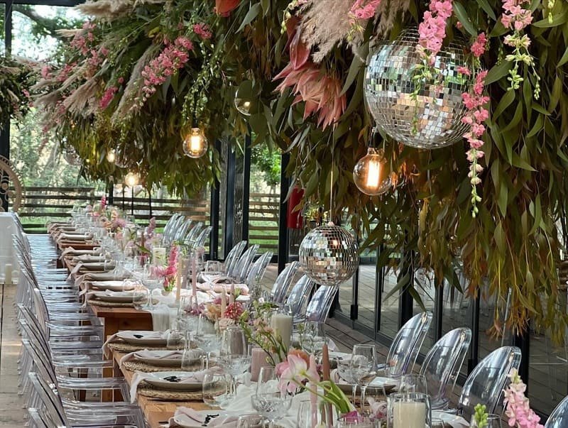
6. Moody Jewel Tones Rich, Romantic, Unapologetic
Think deep emerald, burgundy, navy, plum, and sapphire. This palette is for the couple that wants depth, richness, and theatrical flair. Jewel tones are lush and luxurious, making every detail feel considered and opulent.
Why We Love It:
- Ideal for autumn and winter weddings.
- Creates atmosphere and intimacy.
- Pairs well with candlelit receptions, rich textures, and dramatic lighting.
Pair It With:
Velvet table runners, gold cutlery, dark florals with foliage, glass goblets, and layered stationery. This palette begs for ambient lighting and mood.
How to Choose the Perfect Wedding Colours 2025 for Your Day
Choosing your palette isn’t about following trends; it’s about curating a visual experience that reflects your relationship and your vision for the day. Here’s how to make your choice intentional:
1. Reflect on the Emotion You Want to Evoke
Are you aiming for serenity, intimacy, energy, warmth, or timelessness? Let your emotions lead you. For example:
- Serenity → Coastal or neutral palettes
- Passion & energy → Sunset or jewel tones
- Romance & softness → Pastels
Featured Vendor: Chantall Marshall.
2. Consider Your Venue & Natural Surroundings
Let your venue guide your palette. Coastal venues invite airy hues. Countryside venues work beautifully with earthy tones. A formal ballroom might suit black & white or jewel tones.
3. Think About Seasonality
- Spring/Summer: Pastels, coastal, or sunset hues
- Autumn/Winter: Jewel tones, black & white, earthy palette
South African seasons influence light and landscape; use this to your advantage for photos and floral availability.
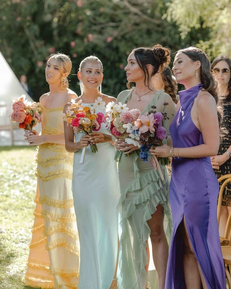
4. Let Fashion Inform Your Choice
Your dress, your bridesmaids’ looks, and your groom’s attire can subtly guide your colour choices. A champagne-toned gown? Lean into warm neutrals. A bold white gown? Maybe black accents are just what you need.
Creating a Cohesive Experience with Your Wedding Colours 2025
Once you’ve chosen your palette, use it thoughtfully across key areas:
- Florals: Let your florist play with tones, texture, and shape to reflect your palette in natural form.
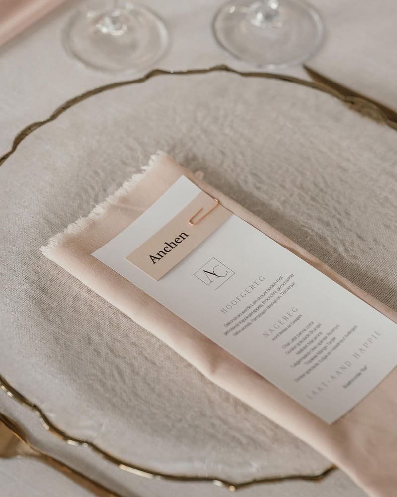
- Stationery: Your invites set the tone, choose paper, fonts, and colours that hint at what’s to come.
- Tablescape: Linens, candles, crockery, and menus should subtly reinforce your palette.
- Fashion: Tie the colours into accessories, bridesmaid dresses, suits, shoes, or floral adornments.
- Cake & Decor: Whether sculptural, floral, or minimal, your cake is another palette opportunity.
Remember: repetition and variation are key. Not everything has to match perfectly, but it should feel like it belongs in the same visual story.


Featured Vendor: Forever like the moon.
Final Thought: Let Your Wedding Colours 2025 Speak Your Story
Colour isn’t just visual, it’s emotional. It’s the way your wedding feels. Whether you walk down the aisle surrounded by the softness of pastels, the calm of coastal tones, or the drama of jewel shades, your palette can express what words sometimes can’t.
Your wedding isn’t just a day, it’s a mood, a memory, and a message. Let your colours speak it, softly or boldly.
Ready to turn your palette into magic?
Explore our list of South Africa’s top florists, planners, and decor stylists on The Bridal Plan. Whether you’re drawn to moody or minimal, we’ll connect you with the right creatives to bring your vision to life.